
Grids
基础栅格
SNX UI 提供了三套栅格系统,分别为 5,12,16 列。在使用过程中,首先需要在外部容器添加.grids-5, .grids-12或.grids-16。如下面的例子,占 [n] 列则使用.g-[n],n 的最大值为所选栅格的列数。
  <div class="grids-5"><!--5栅格-->
    <div class="g-1 grid-blue">1</div>
    <div class="g-4 grid-blue">4</div>
  </div>
栅格中的间距
创建了栅格系统之后,还可以给它添加间距,.gutter类为上右下左都添加间距,.gutter-vertical类为上下添加间距,.gutter-horizontal 类为左右添加间距,.gutter-left类为左侧添加间距,.gutter-right类为右侧添加间距。
  <div class="grids-16 container gutter"><!--16栅格-->
    <div class="g-2 grid-blue gutter-vertical">2</div>
    <div class="g-3 grid-blue gutter-horizontal">3</div>
    <div class="g-4 grid-blue gutter-left">4</div>
    <div class="g-7 grid-blue gutter-right">7</div>
  </div>
响应式栅格
根据不同设备的 Device-Width,可以选择不同类,画面便可以机智的选择堆叠或水平排列,具体参数如下表所示:
| < 568px | < 768px | < 1024px | < 1280px |
|---|---|---|---|
| .g-xs | .g-sm | .g-md | .g-lg |
  <div class="grids-*"><!--16栅格 1280px-->
    <div class="g-xs-* grid-blue">2</div>
    <div class="g-sm-* grid-blue">2</div>
    <div class="g-* grid-blue">2</div>
    <div class="g-md-* grid-blue">2</div>
    <div class="g-lg-* grid-blue">2</div>
  </div>
Table
Tables headfixed strip hover示例
为<table>元素添加.table-bordered类可以为其添加边框;.table-strip类的添加使表格表现出斑马纹;.table-hover类增加悬浮效果。 而为<table>的容器添加.table-responsive使其具有响应式,添加.table-headfixed类可以固定表头。
| key | value |
|---|---|
| hostname |
Didi-PC
|
| type |
Windows_NT
|
| platform |
win32
|
| arch |
x64
|
| release |
6.1.7601
|
| loadavg |
0,0,0
|
| totalmem |
4189683712
|
| freemem |
1403961344
|
| uptime |
6879.241882
|
| createdAt |
Mon Jan 19 2015 10:27:34 GMT+0800 (中国 (標準時))
|
| updatedAt |
Mon Jan 19 2015 10:27:34 GMT+0800 (中国 (標準時))
|
  <div class=" table-responsive table-headfixed">
    <table class="table-bordered table-grey table-strip table-hover">
      <thead>
      <tr>
        <th>...</th>
        <th>...</th>
      </tr>
      </thead>
      <tbody>
      <tr>
        <td class="key">...</td>
        <td class="val">...</td>
      </tr>
      ...
      </tbody>
    </table>
  </div>
Tables underline示例
.table-underline类定义了表格的下划线样式。
| Keywords | Impressions | Clicks | CTR | Rank | CTR |
|---|---|---|---|---|---|
| silly tshirts | 6,000 | 110 | 1.8% | 22.2 | 1.8% |
| 2013 webapps | 9,900 | 460 | 4.6% | 11.5 | 4.6% |
| ring bananaphone | 10,500 | 748 | 7.1% | 17.3 | 7.1% |
  <div class="table-responsive">
    <table class="table-underline" cellspacing="0" cellpadding="0">
      <thead>
      <tr>
        <th>...</th>
        ...
      </tr>
      </thead>
      <tbody>
      <tr>
        <td>...</td>
        ...
      </tr>
      ...
      </tbody>
    </table>
  </div>
Tables bordered示例
.table-bordered类可以为表格添加边框。
| Keywords | Impressions | Clicks | CTR | Rank |
|---|---|---|---|---|
| silly tshirts | 6,000 | 110 | 1.8% | 22.2 |
| 2013 webapps | 9,900 | 460 | 4.6% | 11.5 |
| ring bananaphone | 10,500 | 748 | 7.1% | 17.3 |
  <div class="table-responsive">
    <table class="table-bordered" cellspacing="0" cellpadding="0">
      <thead>
      <tr>
        <th>...</th>
        ...
      </tr>
      </thead>
      <tbody>
      <tr>
        <td>...</td>
        ...
      </tr>
      ...
      </tbody>
    </table>
  </div>
Tables colors示例
为表格中的<th>,<tr>,<td>等标签添加类.[color],可以表现该颜色以突出某些信息。
| Keywords | Impressions | Clicks | CTR | Rank |
|---|---|---|---|---|
| silly tshirts | 6,000 | 110 | 1.8% | 22.2 |
| desktop photos | 2,200 | 500 | 22% | 8.9 |
| arrested quotes | 13,500 | 900 | 6.7% | 12.0 |
| popular web series | 8,700 | 350 | 4% | 7.0 |
| 2013 webapps | 9,900 | 460 | 4.6% | 11.5 |
| ring bananaphone | 10,500 | 748 | 7.1% | 17.3 |
| ring bananaphone | 10,500 | 748 | 7.1% | 17.3 |
  <div class="table-responsive">
    <table class="table-underline" cellspacing="0" cellpadding="0">
      <thead>
      <tr>
        <th>...</th>
        ...
      </tr>
      </thead>
      <tbody>
      <tr class="active">
        <td>...</td>
        ...
      </tr>
      <tr>
        <td>...</td>
        <td class="error">...</td>
        ...
      </tr>
      ...
      </tbody>
    </table>
  </div>
Forms
SNX-UI基础表单测试(默认inline-block)
在<form>元素中添加表单组,如需使用下述样式,务必添加类.form。
  <form class="form">
    <input type="email" placeholder="Email">
    <input type="password" placeholder="Password"  disabled="disabled">
    <label for="remember1">
      <input id="remember1" type="checkbox"> Remember me
    </label>
    <button type="submit" class="btn btn-fl btn-r skyblue">Sign in</button>
  </form>
SNX-UI order表单样式示例
创建顺序样式表单,则添加.form-order类,呈现label与input分行顺序显示。
  <form class="form form-order">
    <label for="email1">Email</label>
    <input id="email1" type="email" placeholder="Email">
    ...
    <label for="state">State</label>
    <select id="state">
      <option>AL</option>
      ...
    </select>
    <label for="remember" class="checkbox">
      <input id="remember" type="checkbox"> Remember me
    </label>
    <button type="submit" class="btn btn-lu skyblue">Sign in</button>
  </form>
SNX-UI input-rounded表单样式示例
为表单中的type为"search""email""url"的input添加.input-rounded类,使其圆角显示。
  <form class="form">
    <label for="search">
      <input class="g-4 input-rounded" id="search" type="search">
      <button type="submit" class="btn btn-fl green">Search</button>
    </label>
  </form>
SNX-UI aligned对齐表单示例
创建对齐样式表单,则添加.input-aligned类,其中.control-group包裹的label与input呈现同行且input分行对显示。使用.controls类包裹的checkbox和提交按钮会配合上述表单特定位置显示。
  <form class="form form-aligned">
    <div class="control-group">
      <label for="username">Username</label>
      <input id="username" type="text" placeholder="Username">
    </div>
    ...
    <div class="controls">
      <label for="cb" class="checkbox">
        <input id="cb" type="checkbox"> I've read the terms and conditions
      </label>
      <button type="submit" class="btn btn-lu skyblue">Submit</button>
    </div>
  </form>
SNX-UI form-block表单示例
为表单添加.form-block类,使得label与input元素block显示并拉伸至父元素的100%。
  <form class="form form-order form-block">
    <div class="control-group">
      <label for="name">Username</label>
      <input id="name" type="text" placeholder="Username">
    </div>
    ...
    <div class="controls">
      <label for="cb2" class="checkbox">
        <input id="cb2" type="checkbox"> I've read the terms and conditions
      </label>
      <button type="submit" class="btn btn-lu skyblue">Submit</button>
    </div>
  </form>
SNX-UI 表单组示例
表单内使用.form-group类,包裹的input元素分组显示。使用<fiedset>标签可规定表单分组样式。
  <form class="form">
    <fieldset class="form-group">
      <input type="text" class="input-1-2" placeholder="Username">
      <input type="text" class="input-1-2" placeholder="Password">
      <input type="email" class="input-1-2" placeholder="Email">
    </fieldset>
    ...
    <button type="submit" class="btn btn-lu green input-1-2">Sign in</button>
  </form>
SNX-UI input-group样式示例
使用.input-group类,包裹的input和放置图标字符的.input-info类联合表示信息提示,兑换顺序则可以对调左右。
    <form class="form form-order">
      <label for="email">字符info提示测试</label>
      <div class="input-group">
        <div class="input-info">@</div>
        <input type="email" placeholder="Email">
      </div>
      <label for="email">checkbox&radio info提示测试</label>
      <div class="input-group">
        <input type="email" placeholder="Name">
        <div class="input-info"><input type="checkbox" id="inside2"></div>
      </div>
      <label></label>
      <div class="input-group">
        <div class="input-info"><input type="radio" id="inside3"></div>
        <input type="email" placeholder="Email">
      </div>
    </form>
SNX-UI input-group大小示例
同样可以使用.input-rounded使.input-group中的input圆角显示。
    <form class="form form-order">
      <label for="email">input-rounded配合input大小测试</label>
      <div class="input-group input-xs">
        <div class="input-info">
          <i class="fa fa-times fa-fw"></i>
        </div>
        <input type="text" placeholder="Do what you want">
      </div>
      <div class="input-group input-sm">
        <div class="input-info">
          <i class="fa fa-star fa-fw"></i>
        </div>
        <input type="text" placeholder="Do what you want">
      </div>
      <div class="input-group">
        <div class="input-info">
          <i class="fa fa-cog fa-fw"></i>
        </div>
        <input class="input-rounded" type="text" placeholder="Do what you want">
      </div>
      <label></label>
      <div class="input-group input-lg">
        <input  class="input-rounded" type="text" placeholder="what do you want">
        <div class="input-info">
          <i class="fa fa-spinner fa-fw"></i>
        </div>
      </div>
      <div class="input-group input-xl">
        <input type="text" placeholder="what do you want">
        <div class="input-info">
          <i class="fa fa-search fa-fw"></i>
        </div>
      </div>
    </form>
SNX-UI Checkbox表单示例
为checkbox使用.checkbox类,具体方法参见Source代码。
  <form class="form form-order">
    <div class="checkbox">Checkbox:
      <label for="test1">
        <input type="checkbox" id=test1 value="">
        Option one is this and that—be sure to include why it's great
      </label>
    </div>
    <div class="checkbox">
      <label for="test2">
        <input id="test2" type="checkbox" value="" disabled="disabled">
        Option two is disabled
      </label>
    </div>
    <div class="checkbox">Checkbox-inline:
      <label for="inlineCheckbox1" class="checkbox-inline">
        <input type="checkbox" id="inlineCheckbox1" value="option1">1
      </label>
      ...
    </div>
  </form>
SNX-UI Radio表单示例
为radio使用.radio类,具体方法参见Source代码。
  <form class="form form-order">
    <div class="radio">Radio:
      <label for="optionsRadios1">
        <input type="radio" id="optionsRadios1" value="option1" checked>
        Option one is this and that—be sure to include why it's great
      </label>
    </div>
    <div class="radio">
      <label for="inlineradio2">
        <input type="radio" id="optionsRadios2" value="option2">
        Option two can be something else and selecting it will deselect option one
      </label>
    </div>
    ...
    <div class="radio">Radio-inline:
      <label for="inlineRadio1" class="radio-inline">
        <input type="radio" id="inlineRadio1" value="option1">1
      </label>
      ...
    </div>
  </form>
按钮组式Checkbox(多选按钮组)示例
.btn-group包裹使用.checkbox类,显示为多选按钮组,具体方法参见Source代码。
  <form class="form form-order">
    <div class="btn-group">
      <label class="btn btn-lu green" for="optiong">
        <input type="checkbox" name="optionsc" id="optiong" >checkbox 1
      </label>
      ...
    </div>
    <label></label>
    <div class="btn-group">
      <label class="btn btn-fl btn-r green" for="optionj">
        <input type="checkbox" name="optionsd" id="optionj" >checkbox 1
      </label>
      ...
    </div>
  </form>
按钮组式Radio(单选按钮组)示例
.btn-group包裹使用.radio类,显示为多选按钮组,具体方法参见Source代码。
  <form class="form form-order">
    <div class="btn-group">
      <label class="btn btn-lu skyblue" for="optiona">
        <input type="radio" name="optionsa" id="optiona" >Radio 1
      </label>
      ...
    </div>
    <label></label>
    <div class="btn-group">
      <label class="btn btn-fl btn-r skyblue" for="optiond">
        <input type="radio" name="optionsb" id="optiond" >Radio 1
      </label>
      ...
    </div>
  </form>
按钮式checkbox、Radio示例
<label>中使用上述button中使用的按钮类,配合使用.checkbox.radio类,显示为多按钮式checkbox、radio,具体方法参见Source代码。
  <form class="form form-order">
    <label>Radio with inline</label>
    <label class="btn btn-lu green radio-inline" for="optionm">
      <input type="radio" name="optionsa" id="optionm" >Radio 1 (preselected)
    </label>
    ...
    <label></label>
    <label class="btn btn-fl btn-r skyblue radio-inline" for="optionp">
      <input type="radio" name="optionsb" id="optionp" >Radio 1 (preselected)
    </label>
    ...
  </form>
SNX-UI 只读表单示例
表单中使用type为text的input元素,表现为如下样式,使用readonly属性变现为只读可复制。
  <form class="form form-order">
    <input type="text" id="text" value="readonly but can copy..." readonly>
  </form>
SNX-UI file示例
表单中使用.file改变传统type为file的input上传样式,具体用法参见如下Source代码。
  <form class="form form-block">
      <span class="file">
        <input class="fbtn" type="file">Select a  file...
      </span>
    <label>This is a help text you put for info</label>
  </form>
SNX-UI color示例
表单中使用type为color的input,变现为如下样式。
  <form class="form">
    <input type="color">
  </form>
SNX-UI date示例
表单中使用type为date的input,变现为如下样式。
  <form class="form">
    <input type="date">
  </form>
SNX-UI number示例
表单中使用type为number的input,变现为如下样式。
  <form class="form">
    <input type="number">
  </form>
SNX-UI textarea示例
表单中使用type为textarea的input,变现为如下样式。
  <form class="form">
    <textarea></textarea>
  </form>
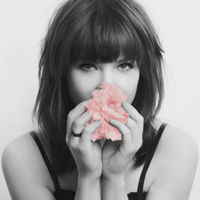
Image
幽灵系列图片样式
如果希望图片能够具有响应式特征,可以为<img>标签添加img类。在图片下方显示信息,可以为<figure>元素添加.img-under类。如果想要让图片呈现圆形[正方形]或椭圆形[长方形],在<img>标签添加类.img-circle。

— Girl Friend —
Singer:Avril Lavigne
  <div class="grids-16">
    <figure class="img-under g-5">
      <img class="img" src="../image/blur.jpg" alt="img">
      <p>hihihi</p>
    </figure>
    <figure class="g-5">
      <img class="img img-circle" src="../image/blur.jpg" alt="img">
    </figure>
  </div>
图片的hover样式
鼠标悬浮触发在图片上显示文字的效果,对figure标签添加.img-above类,并配合使用source中的各标签。
SNX UI Framework
Using the SNX UI will help you to find a easy way to build your amazing website.
  <figure class="img-above">
    <img src="../img/blur.jpg" alt="img14">
    <figcaption>
      <h2>UI Framework</span></h2>
      <span><i class="fa fa-heart-o"></i></span>
      <span><i class="fa fa-thumbs-o-up"></i></span>
      <span><i class="fa fa-paperclip"></i></span>
      <p>Using the SNX UI will help you to find a easy way to build your amazing website.</p>
    </figcaption>
  </figure>
媒体对象的嵌套
这是一个组合样式,图片+文字。为每一个单位的媒体对象容器添加类.media-item,这里务必为<img>添加.img类,以及对文字部分添加.mi-content类。媒体对象可以直接嵌套。

See You Again
Wiz Khalifa & Charlie Puth
and I'll tell you all about it when I see you again.
We've come a long way,from where we began.
oh,I'll tell you all about it when I see you again.
when I see you again.
  <div class="media-item">
    <img class="img" src="...">
    <div class="mi-content" id="...">
      <h3>...</h3>
      <div>
       ...
      </div>
      <div class="media-item">
      ...
      </div>
    </div>
  </div>
媒体对象的垂直相对位置
当媒体对象和说明文字存在一个垂直相对位置,在媒体对象容器添加类.media-center,.media-start,.media-end类,即可表现不同样式。默认情况下图片居上。
see you Again
We love you paul
You'll free in the heaven
  <div class="media-item">
    <img class="img" src="...">
    <div class="mi-content">
      <h3>...</h3>
      <div>...</div>
      </div>
    </div>
  <div class="media-item media-center">
  ...
  </div>
  <div class="media-item media-end">
  ...
  </div>
媒体对象的水平相对位置
对调图片与说明不需要添加其他类,直接调换代码顺序即可。
  <div class="media-item">
    <div class="mi-content">
    ...
    </div>
    <img class="img" src="...">
  </div>
Badges
按钮中的Badge样式
可以为按钮添加小徽章以提示消息,在<button>标签中追加合法元素并为其添加类.badge即可。
  <button class="btn btn-fl skyblue">badge<span class="badge">1</span></button>
  <button class="btn btn-lu green">badge<span class="badge">99+</span></button>
垂直Tab中的badge样式
为可为垂直标签页添加小徽章,在需要添加的位置的<li>标签中追加合法元素并添加类.badge即可。
- Home
- Info
- Contact56
i am home
i am info
i am contact
  <div class="tab-vertical tab-line">
    <ul class="tabs">
      ..
      <li>Contact<span class="badge">56</span></li>
    </ul>
    <div class="tab-content">
      <div class="tab-item">
        <h1>i am home</h1>
      </div>
      ...
    </div>
  </div>
水平Tab中的badge样式
为可为水平标签页添加小徽章,在需要添加的位置的<li>标签中追加合法元素并添加类.badge即可。
- Home
- Info99+
- Contact
i am home
  <div class="tab-horizontal tab-line divider">
    <ul class="tabs">
      <li class="tab-choosed">Home</li>
      <li>Info<span class="badge">99+</span></li>
      <li>Contact</li>
    </ul>
    <div class="tab-content">
      <div class="tab-item" style="display: block;">...</div>
      <div class="tab-item" style="display: none;">...</div>
      <div class="tab-item" style="display: none;">...</div>
    </div>
  </div>
Pagination
方正有框样式
如果要使用带边框的翻页页码,为其添加类.pgn,.pgn-border即可,如果表示选中样式,单独为<a>标签添加类.pgn-choosed。
  <ul class="pgn pgn-border">
    <li><a>Previous</a></li>
    <li><a>1</a></li>
    ...
    <li><a class="pgn-choosed">3</a></li>
    ...
    <li><a>Next</a></li>
  </ul>
圆形边框样式
使用圆形边框的翻页页码,为其添加类.pgn,.pgn-roundborder即可,如果表示选中样式,单独为<a>标签添加类.pgn-choosed, 前一页和后一页分别对应添加类.pgn-pre和.pgn-next。
  <div class="pgn pgn-roundborder">
    <a class="pgn-pre"></a>
    <a>1</a>
    <a class="pgn-choosed">2</a>
    ...
    <a class="pgn-next"></a>
  </div>
Label
h1~h6中基础颜色样式
标签可以突出显示当前部分强调的点,在h1~h6标签中追加一个合法标签并添加类.label和.label-[color]即可。
Example heading New
Example heading New
Example heading New
Example heading New
Example heading New
Example heading New
  <h1>Example heading <span class="label label-skyblue">New</span></h1>
  ...
  <h6>Example heading <span class="label label-default">New</span></h6>
<h1><a href="...">Default <span class="label label-default">New</span></a></h1>
Button嵌套样式
在按钮中使用标签的方法也是在其中追加一个合法标签并添加类.label和.label-[color]。
  <button class="btn btn-lu skyblue">Default <span class="label label-green">New!</span></button>
  <button class="code-display btn btn-fl default">Source</button>
Helper
居中